UI Packs
Mallwave HUD Bars — health, mana and stamina
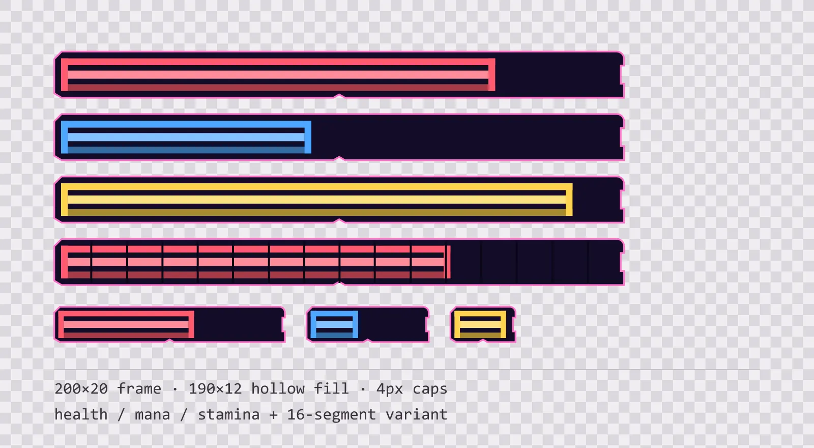
16 atrium light HUD bar sprites: standard, slim and vertical frames, three hollow-core fills in each, plus segmented, ghost and shield variants. SVG plus transparent PNG.
About this pack
Bars at 200x20 with sixteen divisions. A shop screen shows quantities rather than health, and quantities want a finer scale than a combat meter does.
The frame is a nine-slice with 4 px end caps, so it stretches to any width without the ends deforming — a full-width boss bar and a 40 px enemy nameplate bar use the same file.
The fills are separate sprites rather than baked into the frame, which is the part that matters in practice: you scale the fill's width from zero to full and the frame never moves. Each fill is a hollow shell with a bright core running through it, so the socket colour shows between the edges and the bar reads as contained energy rather than paint.
There are three colours, one per resource: health, mana and stamina. They are spaced apart in brightness as well as hue, which is the part that survives a greyscale screenshot and the most common forms of colour blindness. A set tuned to identical lightness looks balanced in a swatch row and collapses into one grey block on screen.
The segmented variant adds 15 notch lines over the same frame, for games that count discrete pips — hearts, charges, ammo — rather than a continuous percentage. It is a separate file rather than an overlay, so you can drop it in without changing your bar widget.
Three frame builds cover where bars actually sit: the standard bar, a slim one for enemy nameplates, and a vertical one, because a mana column is not a rotated health bar — rotating a nine-slice stretches its caps along the wrong axis. Each build has its own set of three fills.
Two overlay fills handle the states a single bar cannot show on its own. The ghost fill is hollow and dashed: it marks the segment just lost, so a hit reads as a change rather than a new number. The shield fill is hatched rather than tinted, because an absorb layer sits on top of the resource bar and a second colour there collides with the colour underneath it. Everything is included as editable SVG and as flat transparent PNG at 1x, 2x and 4x.
Download
Direct link · no sign-up · no wait pageComplete kit — SVG sources, PNG exports at 1x/2x/4x, licence and readme

How to use it
- Draw the frame first, then the fill on top with its left edge inset by the 4 px cap width; animating only the fill's width keeps the frame's ends perfectly still.
- In Unity, set the fill image to Image Type Filled with Fill Method Horizontal, or use a Sliced image and animate the RectTransform width — both work because the fill has no rounded corners of its own.
- In Godot 4, a TextureProgressBar with the frame as Under Texture and the fill as Progress Texture reproduces the whole thing with no code, and Stretch Mode set to Tile keeps the caps intact.
- For pip-style resources, use the segmented frame and snap the fill width to multiples of one 16th of the inner width so the fill edge always lands on a notch.
License
Creative Commons Attribution 4.0 — Free for commercial use. Credit required. Full terms · What this means in practice
"Mallwave HUD Bars — health, mana and stamina" by Oğuzhan Girgin, licensed under CC BY 4.0 — https://www.colorosse.com/assets/2d/ui/mallwave-hud-barsAlso browse
More UI Packs
See all →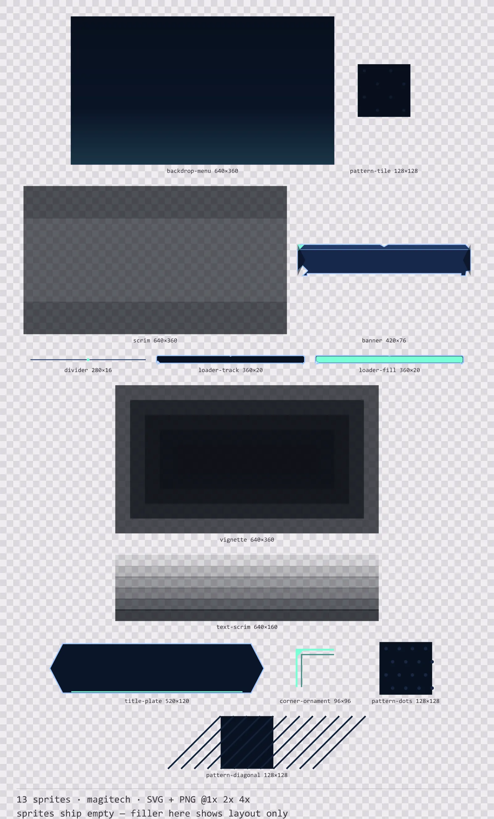
Aetherlab Backdrops
13 magitech background and overlay pieces for dark interfaces — lab navy with aether cyan accents. SVG plus transparent PNG at 1x, 2x and 4x.
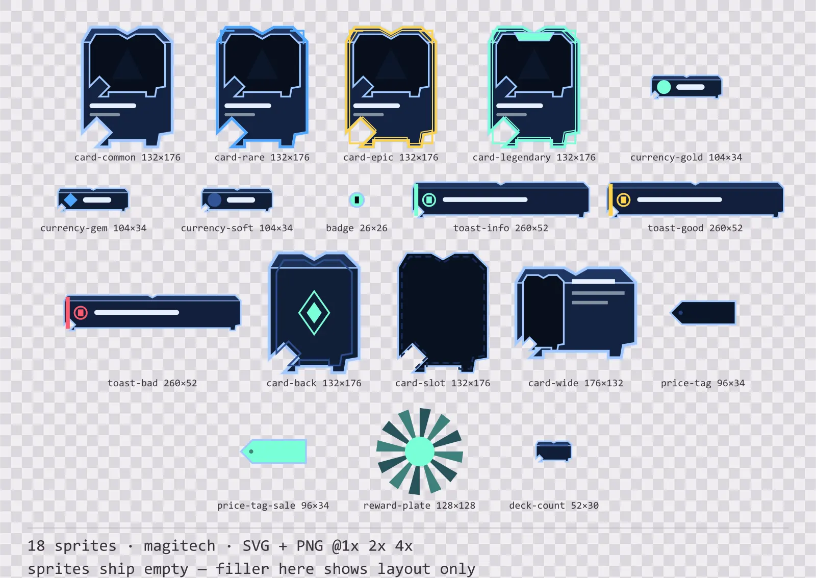
Aetherlab Card Frames
18 magitech card, currency and notification components for dark interfaces — lab navy with aether cyan accents. SVG plus transparent PNG at 1x, 2x and 4x.
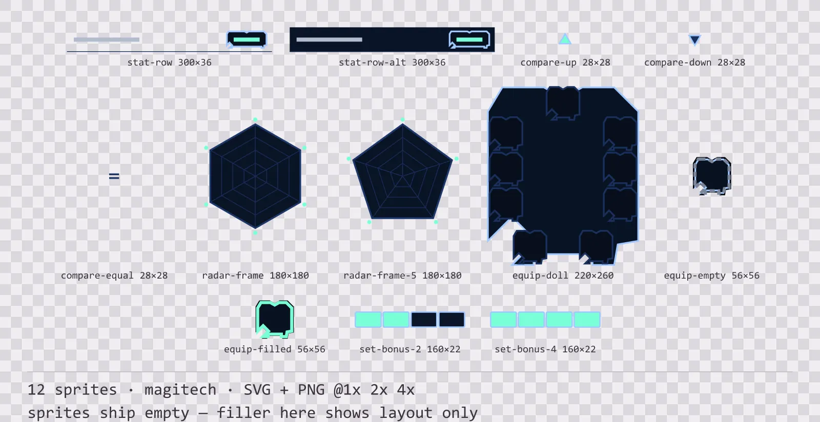
Aetherlab Character Sheet
12 magitech character sheet and stat widgets for dark interfaces — lab navy with aether cyan accents. SVG plus transparent PNG at 1x, 2x and 4x.
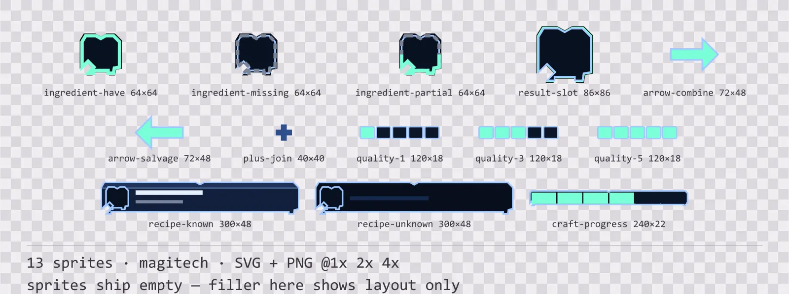
Aetherlab Crafting UI
13 magitech crafting and recipe widgets for dark interfaces — lab navy with aether cyan accents. SVG plus transparent PNG at 1x, 2x and 4x.